Overview
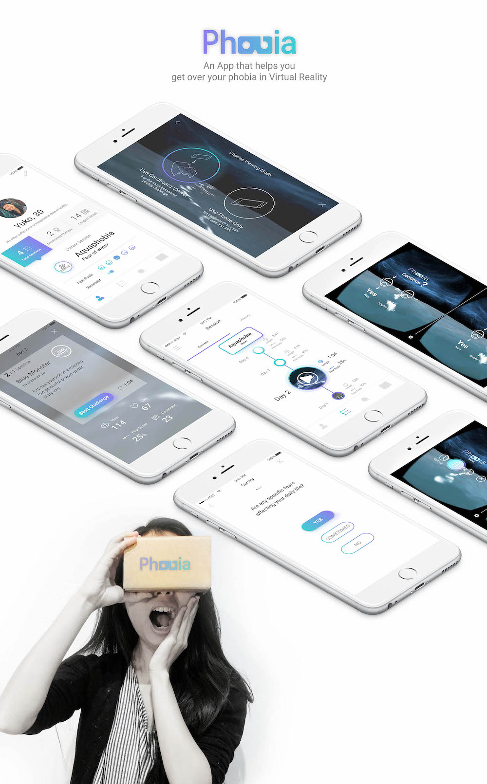
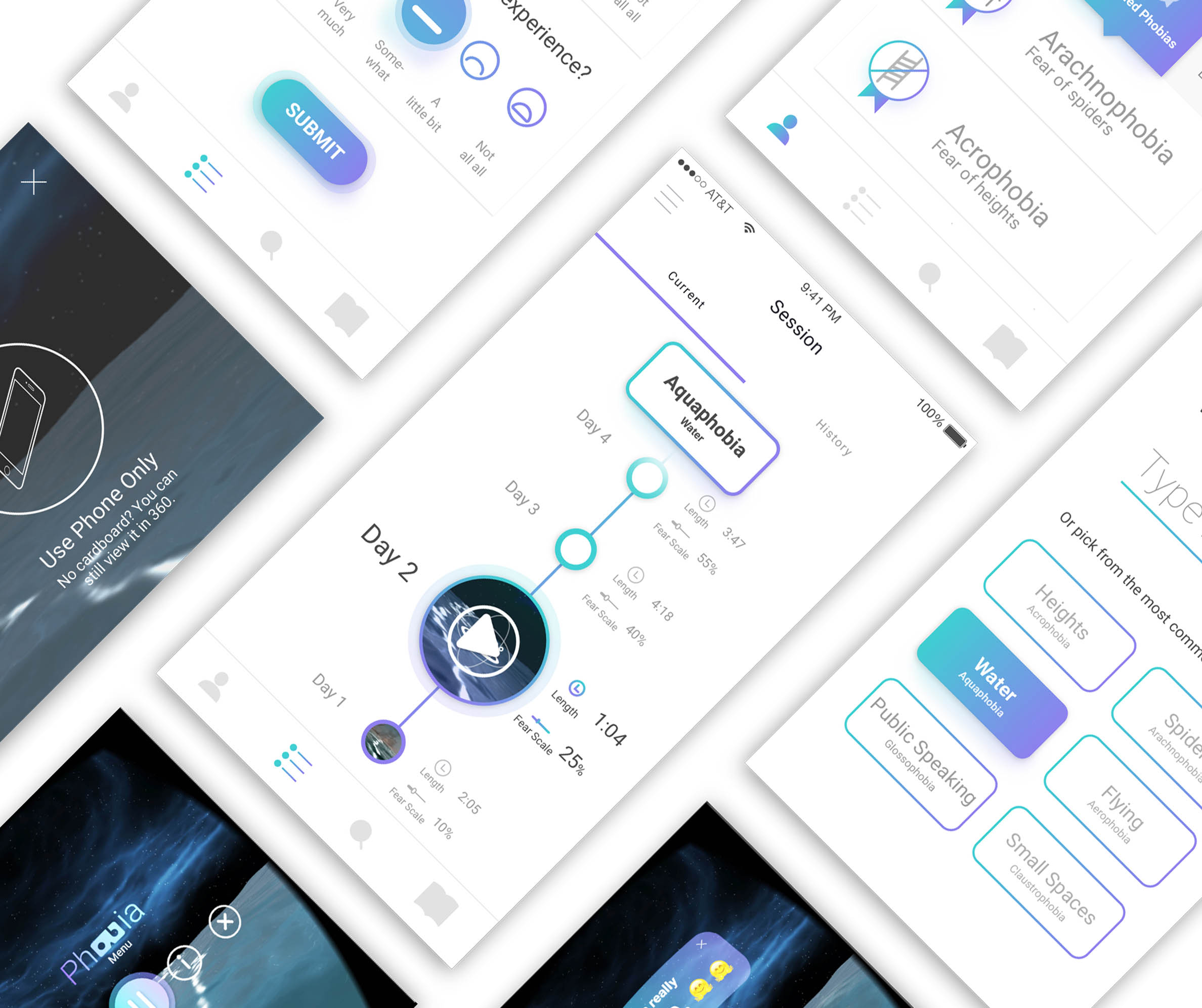
Early motion prototype, made by Principle.
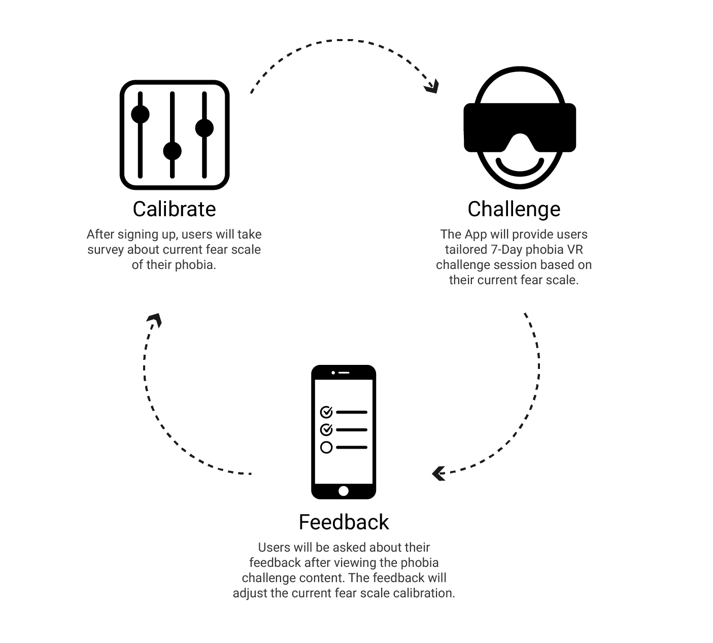
Main behavior model: 'calibrate - challenge - feedback' loop.
Problem Identification
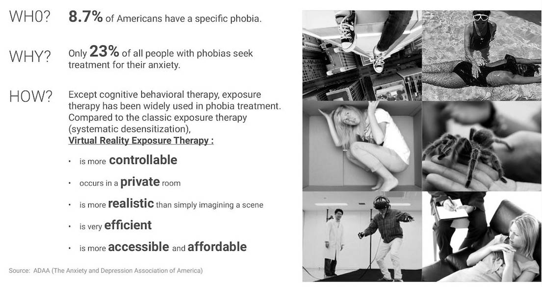
Brainstorming
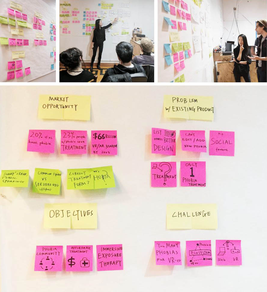
After some early-stage research about phobia VR therapy, I started my design sprint with brainstorming with sticky notes. Then I grouped and organized the notes in an affinity diagram based on their relationships. To avoid being close minded, I invited some friends over for their feedbacks and asked them to pick their favorite ideas. This process helped me to generate promising ideas for further development.
Persona
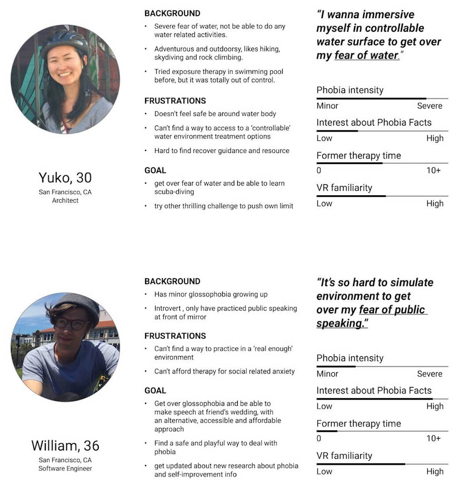
After brainstorming about product goal and features, I created two fictional "characters" to uncover patterns in behavioral sliders, pain points and user goals. Each of them represented one type of users, which might guide me to next design challenge.
Site Map
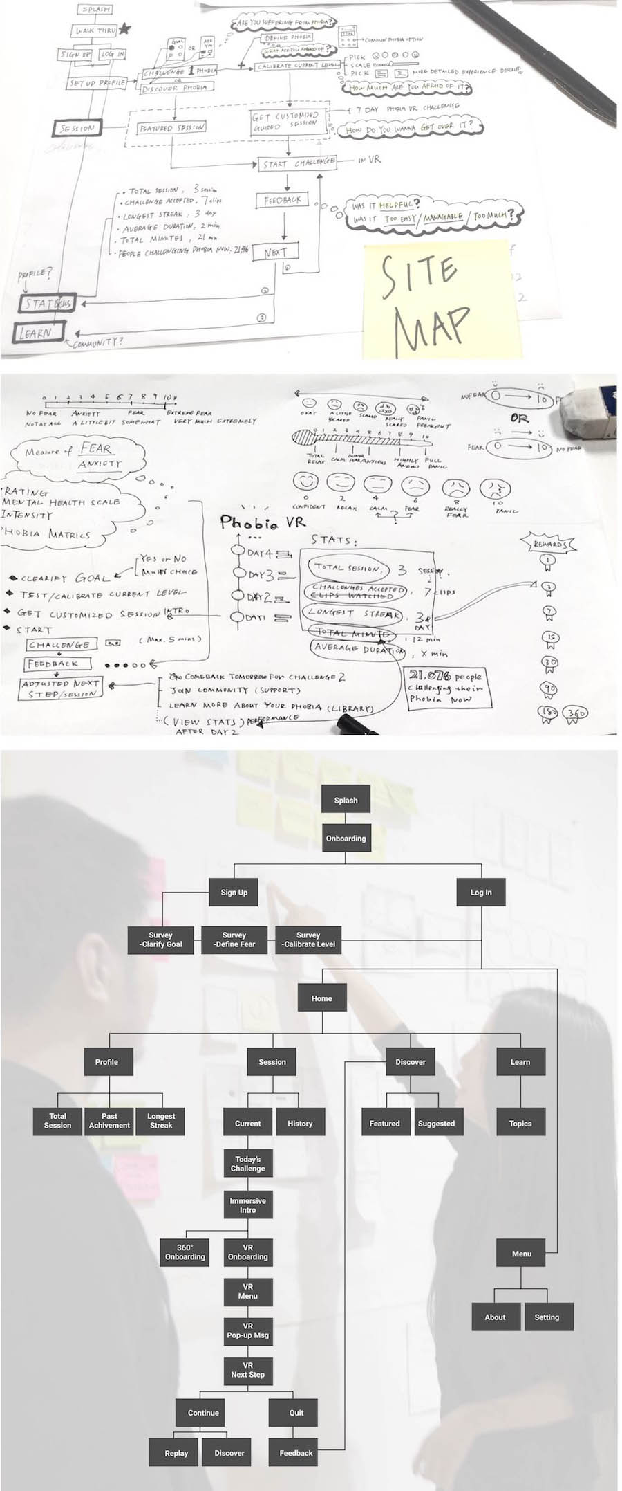
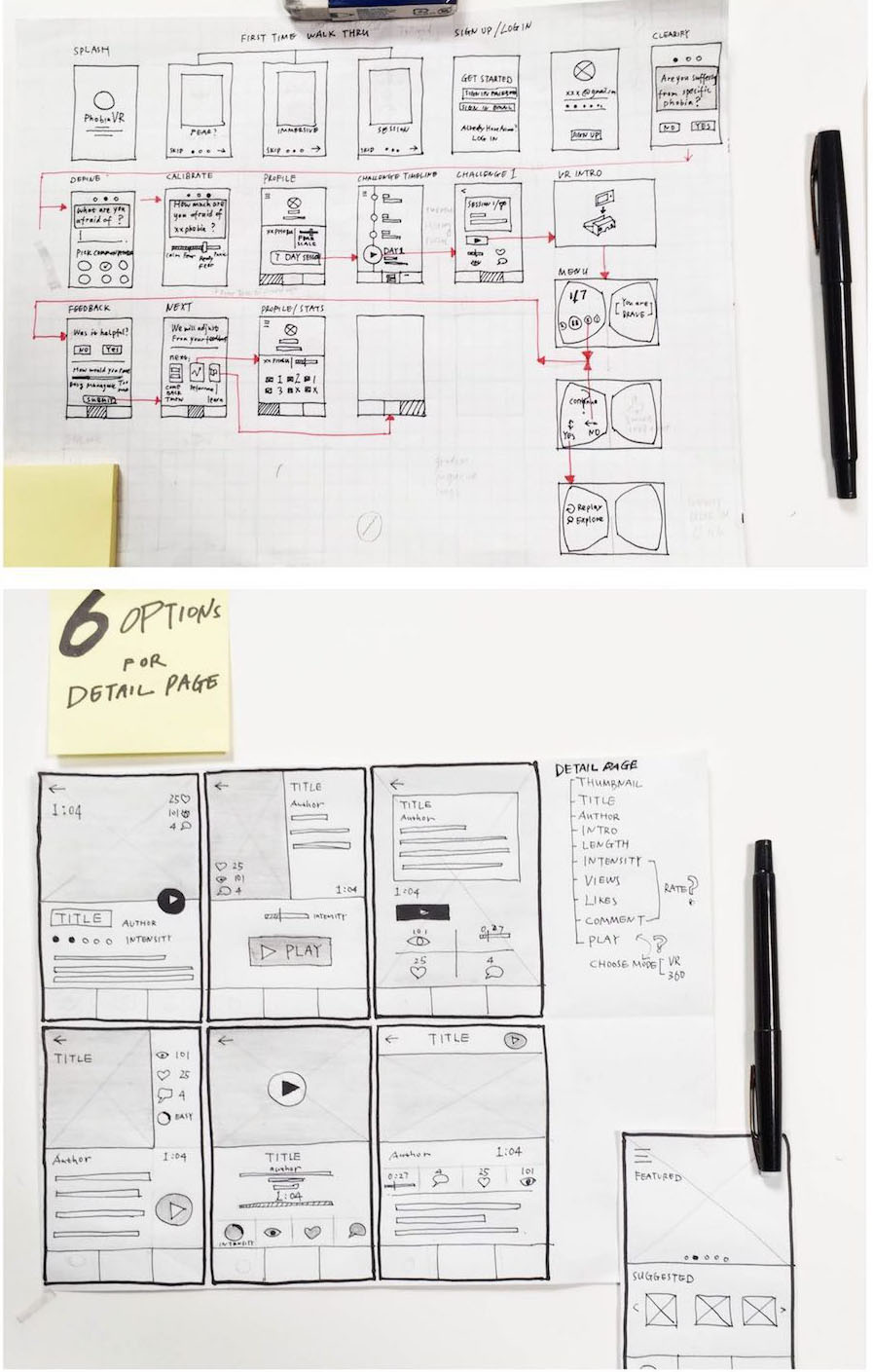
UI Sketch
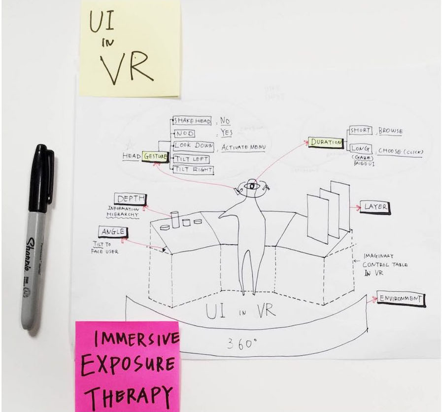
UI in VR
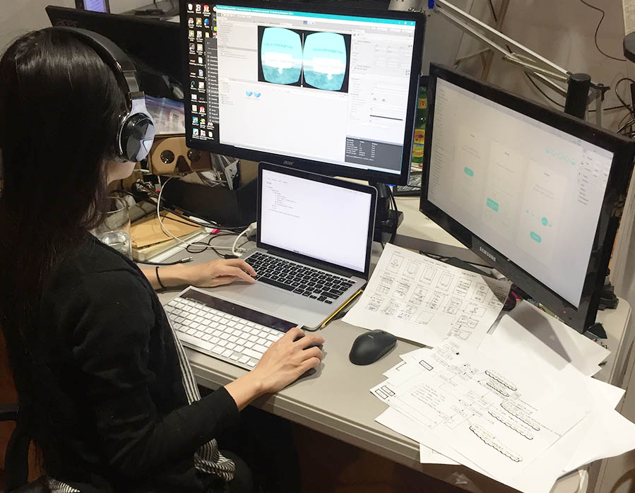
After sketching and some user testing of 2D UI, I started to prototype the 3D UI in VR in Unity3D. I used Unity3D Standard Asset to generate an animated water surface which is mapped at eye level of user (challenge for aquaphobia users). Then I started to merge some simple interface I designed in SketchApp and Adobe Illustrator to my VR scene for further user testing.
Scoping VR UI in 'imaginary control table'.
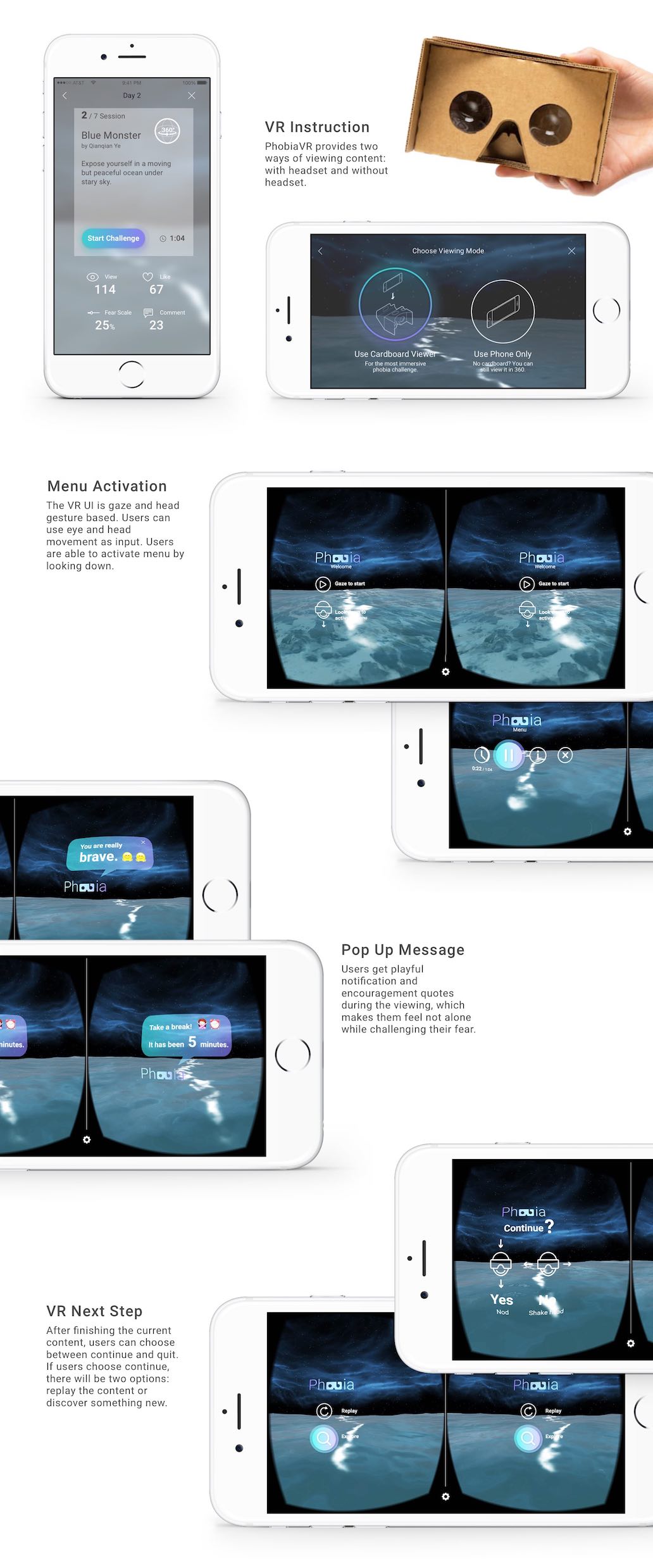
In the illustration below, I summarized 4 principles for VR interface elements, which are angle, depth, layer and environment. You can see how the elements are displayed in the 'imaginary control table in VR'. After experimenting different VR UI input methods, I decided two ways of user input in my VR interaction: head gestures and eye movement. The main UI will be gaze based and the other playful elements are head gesture based (like nodding for yes and shaking head for no).
Wireframe

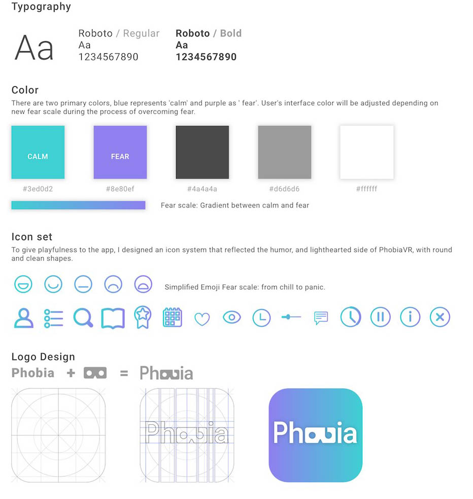
Visual Identity
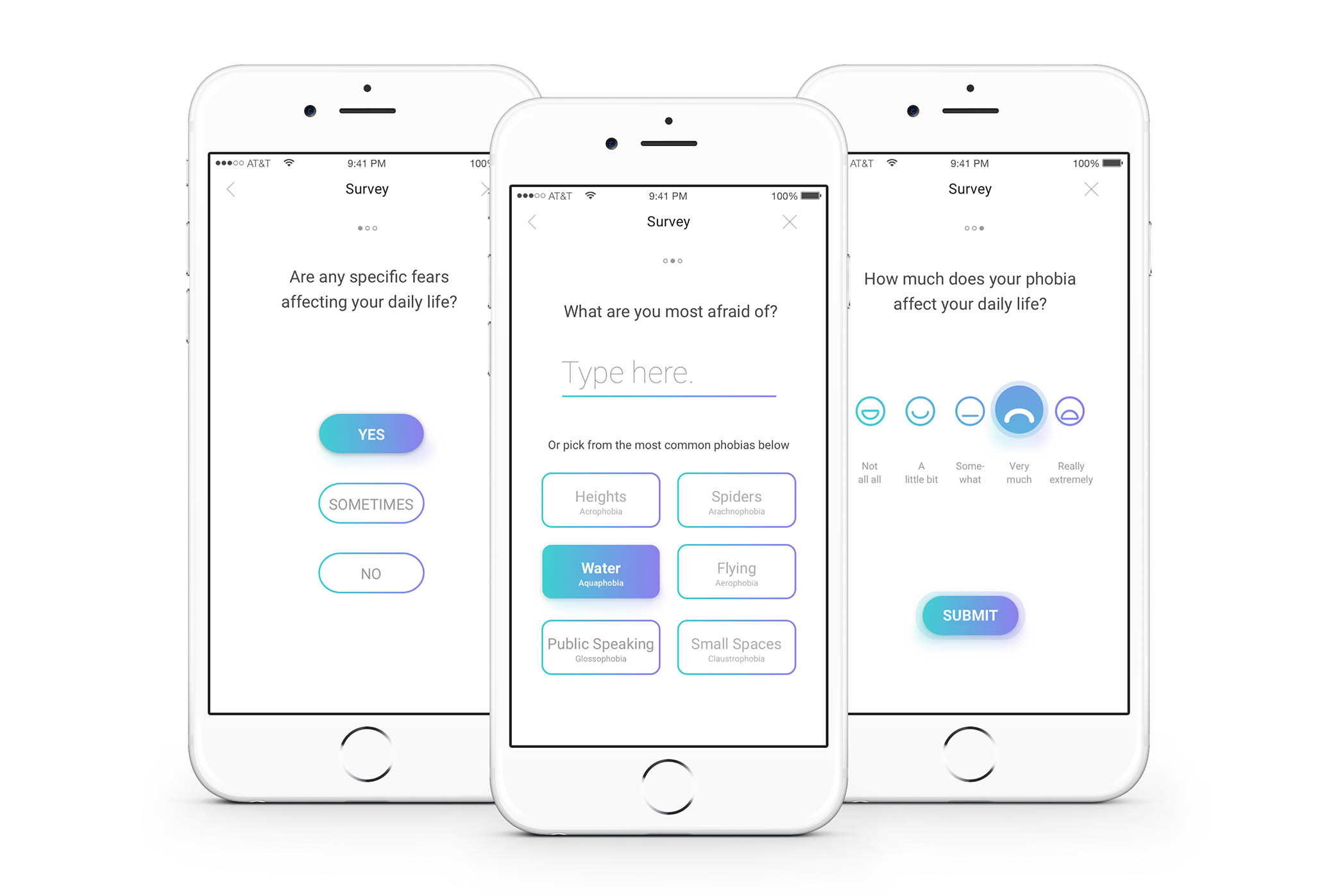
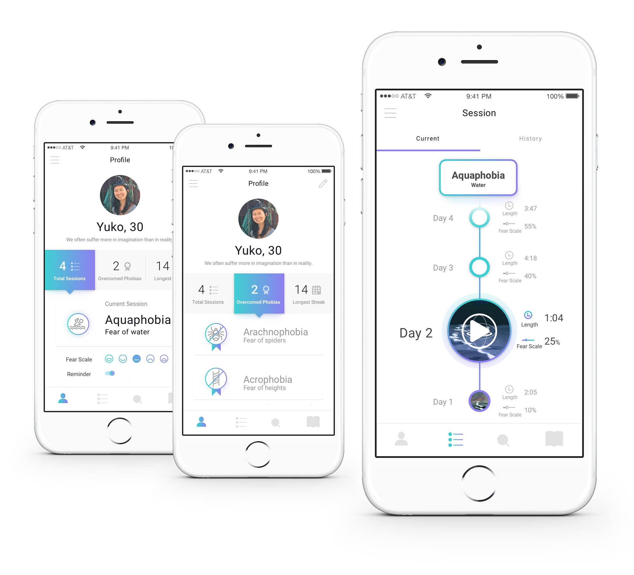
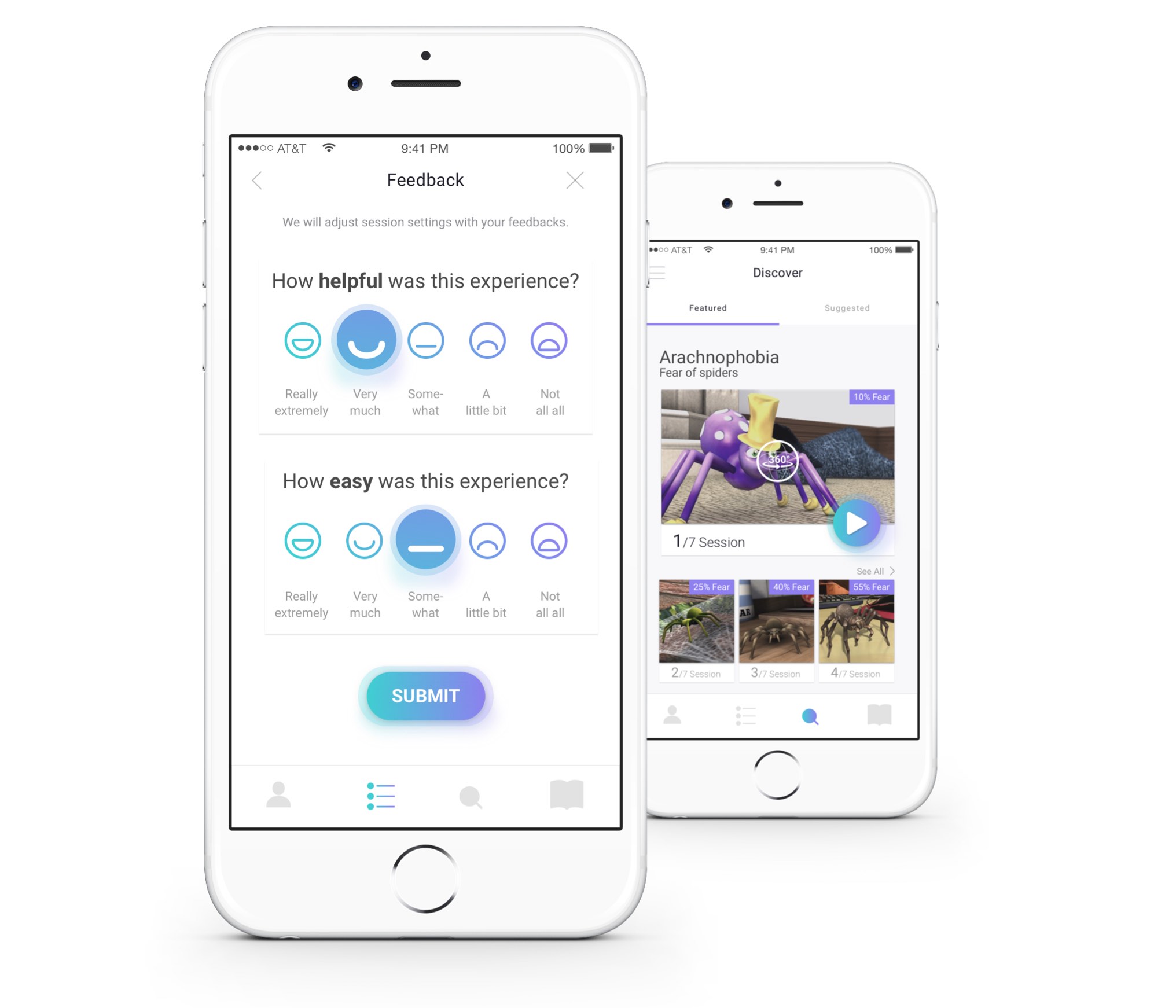
Selected UI
